
Image: Photo by Domingo Alvarez on Unsplash
We move through modern life and are constantly confronted by noise.
Mobile, desktop, iPad, bus stops, train stations, TV, emojis, billboards, shopping, driving well I can keep going but the noise is out of control. How do we cut through? Brands have known for years that the best way to slice through is to use devices that:
-
Reduce our thinking time
-
Make us feel comfortable
-
Are easily recognisable
-
Resonate
-
Have meaning that is implied
The trap we are falling into now is we are all using the same symbols and they are losing their effectiveness with customers and falling into noise territory. 😉
Obviously certain symbols, icons and emojis make sense to have them carry a certain sameness when it comes to a website navigation say but when it comes to identity, awareness and emotion it is much harder to cut through when we are all using the same icons to do it.
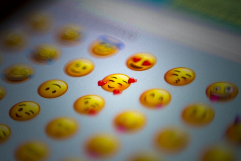
When we look at emojis there is a very key reason why they are both popular and useful. They instantly convey a feeling or emotion across language barriers between two people. They provide a mental shortcut that we instantly feel comfortable with and immediately adopt into every day communications.
Now I get it, developing icons is not something a startup sees as a valuable and important use of their time.. I have had those conversations where clearly the time to make an icon plays second place to the app, tool, site, product being developed and pushed out the door.
I want to challenge this approach...
Emotion is a powerful state of mind. A heart = love, smile = happy, cross = religion, Apple = apple, xxx = sex. These are tools used by successful ad agencies for years as they recognise the power of emotion but it is something more recent altruistic designer’s seem to be missing.
Symbols, Icons and Emojis are not to be grabbed at the last minute as part of the final push of your app, site or product. They need to be deeply woven into your thinking to ensure the customers you are targeting are able to associate or resonate with your path or product. Using symbols that forget this risk not only unwanted interactions but negative association with your idea.
Research is important, research is important, research is important. What I think we need to do is add symbols and icons to research to embed this as an important element from the beginning and to make it one of the key learning objectives..
If you know me you know mythology is important, but that I’ll leave that for my talk I gave at UXNZ. The point is that symbols are not only a useful tool, they are essential in what we do.
In a time where cut-through is one of those challenging paradigms, making use of elements that help with cognitive dissonance is vital. We need to make use of tools that form mental models and build them into our designs.
Image: Photo by Domingo Alvarez on Unsplash
We move through modern life and are constantly confronted by noise.
Mobile, desktop, iPad, bus stops, train stations, TV, emojis, billboards, shopping, driving well I can keep going but the noise is out of control. How do we cut through? Brands have known for years that the best way to slice through is to use devices that:
-
Reduce our thinking time
-
Make us feel comfortable
-
Are easily recognisable
-
Resonate
-
Have meaning that is implied
The trap we are falling into now is we are all using the same symbols and they are losing their effectiveness with customers and falling into noise territory. 😉
Obviously certain symbols, icons and emojis make sense to have them carry a certain sameness when it comes to a website navigation say but when it comes to identity, awareness and emotion it is much harder to cut through when we are all using the same icons to do it.
When we look at emojis there is a very key reason why they are both popular and useful. They instantly convey a feeling or emotion across language barriers between two people. They provide a mental shortcut that we instantly feel comfortable with and immediately adopt into every day communications.
Now I get it, developing icons is not something a startup sees as a valuable and important use of their time.. I have had those conversations where clearly the time to make an icon plays second place to the app, tool, site, product being developed and pushed out the door.
I want to challenge this approach...
Emotion is a powerful state of mind. A heart = love, smile = happy, cross = religion, Apple = apple, xxx = sex. These are tools used by successful ad agencies for years as they recognise the power of emotion but it is something more recent altruistic designer’s seem to be missing.
Symbols, Icons and Emojis are not to be grabbed at the last minute as part of the final push of your app, site or product. They need to be deeply woven into your thinking to ensure the customers you are targeting are able to associate or resonate with your path or product. Using symbols that forget this risk not only unwanted interactions but negative association with your idea.
Research is important, research is important, research is important. What I think we need to do is add symbols and icons to research to embed this as an important element from the beginning and to make it one of the key learning objectives..
If you know me you know mythology is important, but that I’ll leave that for my talk I gave at UXNZ. The point is that symbols are not only a useful tool, they are essential in what we do.
In a time where cut-through is one of those challenging paradigms, making use of elements that help with cognitive dissonance is vital. We need to make use of tools that form mental models and build them into our designs.